UX/UI / App Design / Prototyping / User Testing
PROJECT OVERVIEW
Focus Flow is an interactive app developed as part of the University of Waterloo Futures Lab (first cohort), in partnership with Google. It is designed to help students turn their study sessions into structured learning journeys.
The experience breaks study time into focused modules that combine reading, quizzing, and short game-based breaks to maintain engagement and reduce burnout. By structuring sessions in this way, Focus Flow encourages more consistent focus while making studying feel more interactive and manageable.
Disclaimer: This project was developed within a constrained timeframe and toolset. The visual design does not fully reflect the intended level of polish and refinement.
PROJECT DURATION
8 Weeks
ROLE
UX Designer
TOOLS USED
Google AI Studio, Firebase, Figma, Gemini
Imagine you're a student with ADHD…

You sit down, ready to study…

You start reading your notes…

And you get overwhelmed…

Then you get distracted…

And more distracted…

What should
I eat for dinner?
Still distracted…
Could a cow beat
a million ants in
a fight?
Wireframing
Streamline Learning
Create a modular lesson based on imported long form text documents or a simple prompt.
Image generation
Provide graphics to visualize the topic.
Gamification
Provide game breaks between lessons and quizzes to engage users and keep them focused.

Prototype 1


Back to our friend…
Introduces Focus Flow
Wow! This is
awesome,
but it still needs
some work…

The Good
Fast journey generation time
"The loading game is a clever way to hold users' attention"
Modular lesson segmentation made learning more engaging
The Bad
Image generation doesn't work
Confusing UX on the launch page
Pomodoro timer is confusing
Missing back buttons in the learning modules
Key Areas of Improvement
Create clearer access points to start learning journeys
Users were confused with the button options to start their journey and often clicked wrong buttons.
Give users the option to go back when in the learning modules
Users often wanted to reference the lesson when completing the quizzes but were unable to go back.
Add visuals to lessons
The current model we were using was unable to produce images without significantly increasing load time.
Improve the Pomodoro timer
Users were not drawn to start the timer, and when clicking into the break, they were unable to return back to the lesson.
Improve overall UI
ex. the dashboard text was low contrast, and the moving wave at the bottom of the screen was distracting.

User Feedback and Further Research Notes
UI
add glow around buttons to attract attention
minimal colour palette
action on buttons, not just icons.
UX
encouragement along journey
Minimal UI when doing the lesson to decrease distraction
Fix entry points/make them more obvious
add back button to review content or change answers
track progress
achievements
progress bar
full journey on the pop out menu
Other Considerations
Increase gamification
one continuous game over the course of the lesson
ex. bubble shooter, players get 3 turns per game break. also get points for getting quiz answers correct.Total tally of points added at the end of the lesson/assignment and gets added to their XP
Leaderboard to see how other users are doing.
Taking this all into consideration, I created mockups in Figma to give to my developer.


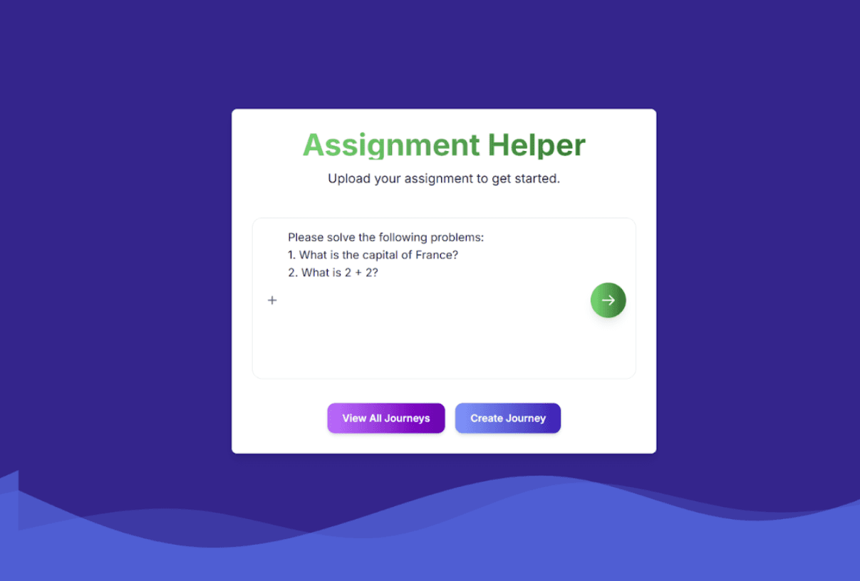
Prototype 2
Improved CTA on launch page
Clear buttons to start Focus Flow vs. Assignment Helper.
Image generation
Improved image generation by reading and editing documentation to fix bugs
Improved overall UI
Used a soft gradient background and improved contrast between text elements and the background.


Back to our friend…
You sit down, ready to study…
You start reading your notes…
And you get overwhelmed…

Lets cook…

I understand
it now…
Conclusion
The Good
Images generate fast and accurately
Added Firestore to store past journeys
Intuitive access points to start Focus Flow and Assignment Helper
Option for user to select model type so user has more say in response time/accuracy
Still Needs Work
Pomodoro timer still the same
Shared journey dashboard across all users
Accuracy of content in modules and quizzes
Figma designs weren't fully reflected
Still lacking gamifaction
Reflection
Designing With User Needs at the Center
Throughout the project, we focused on creating a clear, structured experience that reduced cognitive overload for students. By refining navigation, simplifying CTAs, and tightening the UI, we aimed to make the flow intuitive and easy to follow from start to finish.
Iterating Through Feedback and Refinement
Moving from Prototype 1 to Prototype 2 showed how impactful small design changes can be. Improvements to layout, contrast, and flow helped reduce confusion and made the overall experience feel more intentional and user-friendly.
Collaborating Across Design and Development
Working with a developer highlighted the realities of cross-functional collaboration. As implementation was handled externally, I wasn’t always in control of the final output, even for smaller changes. While challenging, this was a valuable learning experience that reinforced the importance of clear communication, documentation, and alignment between design and development.
GET IN TOUCH
Always open to opportunities, whether it’s a project, a role, or just a conversation.

Copy component
Copied
ben.mascarenahs23@gmail.com


BEN MASCARENHAS
