A fresh new look for Social Development Centre Waterloo Region.
Web Design
Market Research
UX/UI
Prototyping
Social Development Centre Region of Waterloo

My Role:
UX/UI Designer and Researcher
Team:
Myself, Simone, & Leon
Project Duration:
12 Weeks
Goal:
Create a consistent brand identity and refresh SDC's outdated website.
Tools:
Figma
Adobe Photoshop
Similar Web
Introduction
As part of the DAC:300 Digital Research Project course at the University of Waterloo, working in a team of three, we were tasked with partnering with a local non-profit organization to help them rebrand their digital identity, including a logo, colour palette, typography, and most importantly, an improved website prototype. My role focused on designing the landing page, program pages, ecosystem analysis, and navigation planning.
Ecosystem Analysis
The initial research for this project began before selecting the non-profit we would partner with. We wanted to ensure our work would have a real impact, so we started by examining several organizations to understand who might benefit most from a refreshed digital identity. We reviewed four non-profits that showed clear opportunities for improvement and one that was performing well as a benchmark. Using Similarweb data, our design expertise, and insights from focus groups, we conducted a landscape analysis to evaluate their digital presence. Our categories and metrics were as follows:
Category | Metric 1 | Metric 2 | Metric 3 | Metric 4 |
Website Traffic and Engagement | Monthly Unique Visitors | Bounce Rate | Average Session Duration | Pages Per Session |
Content Quality and Relevance | Clarity of Mission and Goals | Frequency of Updates | Diversity of Media | Call-to-Action Effectiveness |
User Experience and Design | Ease of Navigation | Mobile Optimization | Page Load Speed | Accessibility |
Conversion Effectiveness | Donation Process | Volunteer Sign-up Flow | Email Capture Effectiveness | Event Registration |
Each metric was given a rating out of 5 and then averaged out to give a total score out of 5 for each category. For more subjective metrics like “clarity of mission and goals” or “ease of navigation”, we required some opinions outside of our group of three, so we created a focus group with our classmates and asked them to review some metrics to better inform our final rating, minimize bias, and improve the reliability of our scores.
Perceptual Maps
After calculating final ratings, we created two perceptual maps to visually compare the differences in performance between organizations


Problem Statement
Research revealed that SDC’s website struggled with navigation clarity, visual consistency, and effectively communicating its mission. Compared to similar organizations, users found it difficult to understand SDC’s programs, navigate between pages, and engage with content, especially on mobile. These findings informed the core problems we set out to address through design.
5 Core Areas of Improvement
Working closely with SDC’s director and head of marketing, we identified 5 core areas of improvement for their website.
1
Mobile Optimization
Design a mobile version of the website
2
Consistency & Layout
Ensure a uniform design across all pages and improve spacing, alignment, and section structure
3
Branding and Visual Appeal
Create a modern, rounded, and flowing aesthetic
4
Landing Page & Vision
Develop a stronger landing page that outlines their vision and values
5
Navigation & UX
Organize the sidebar for better accessibility and improve the navigation bar, and make clearer categories
Inspiration Board

Fixing the Site Navigation
To solve part of the Navigation and UX problem, we created a sitemap to lay out how we want users to navigate the website. Then created a navigation bar in Figma.


Branding
Colour Pallete
Typography
Website Font
Logo Font

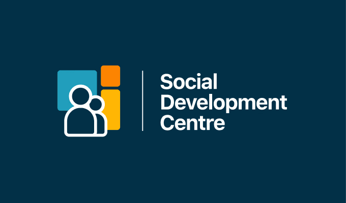
Logo

My Contributions
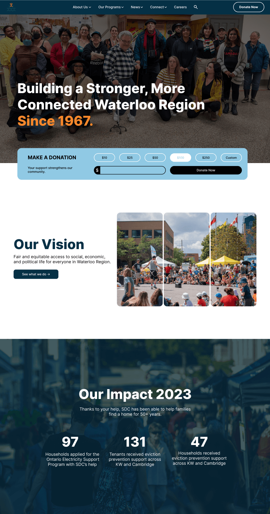
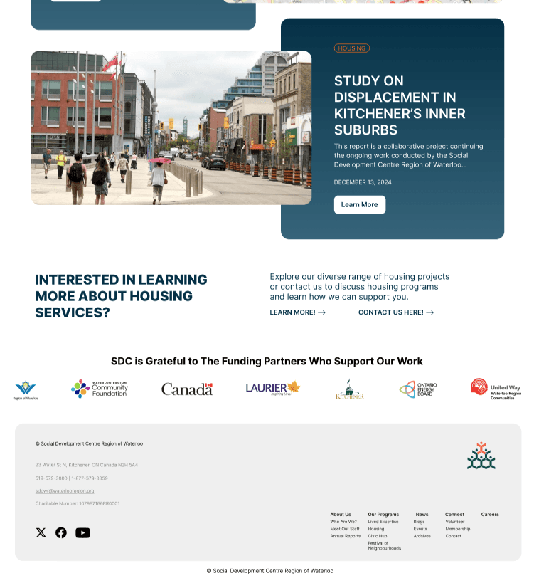
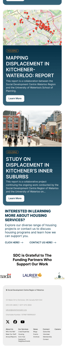
Landing Page


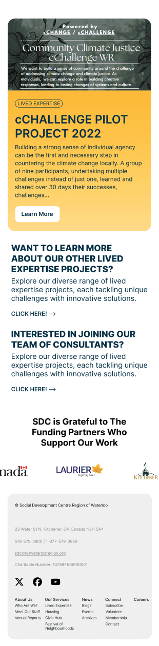
Lived Expertise Program Page


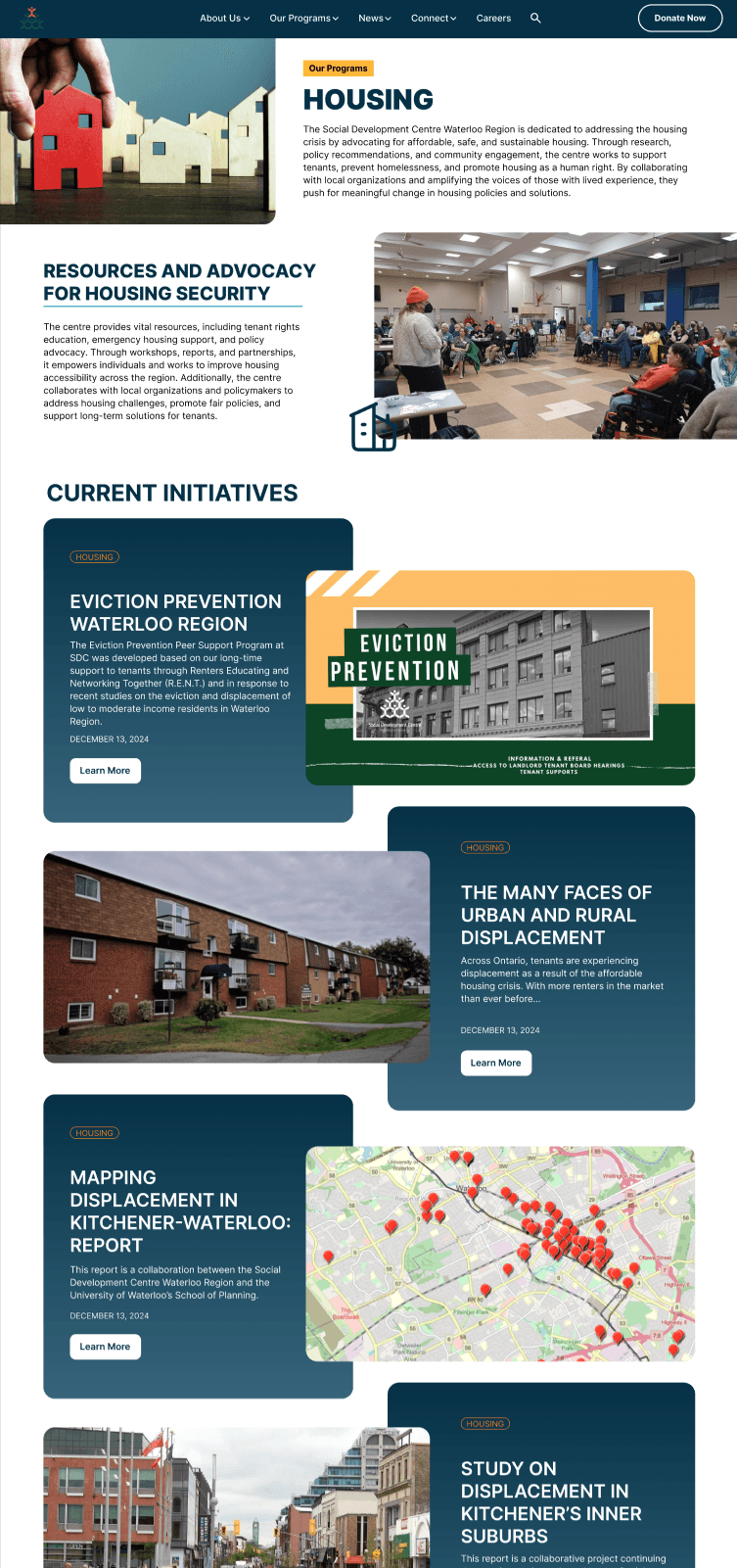
Housing Program Page

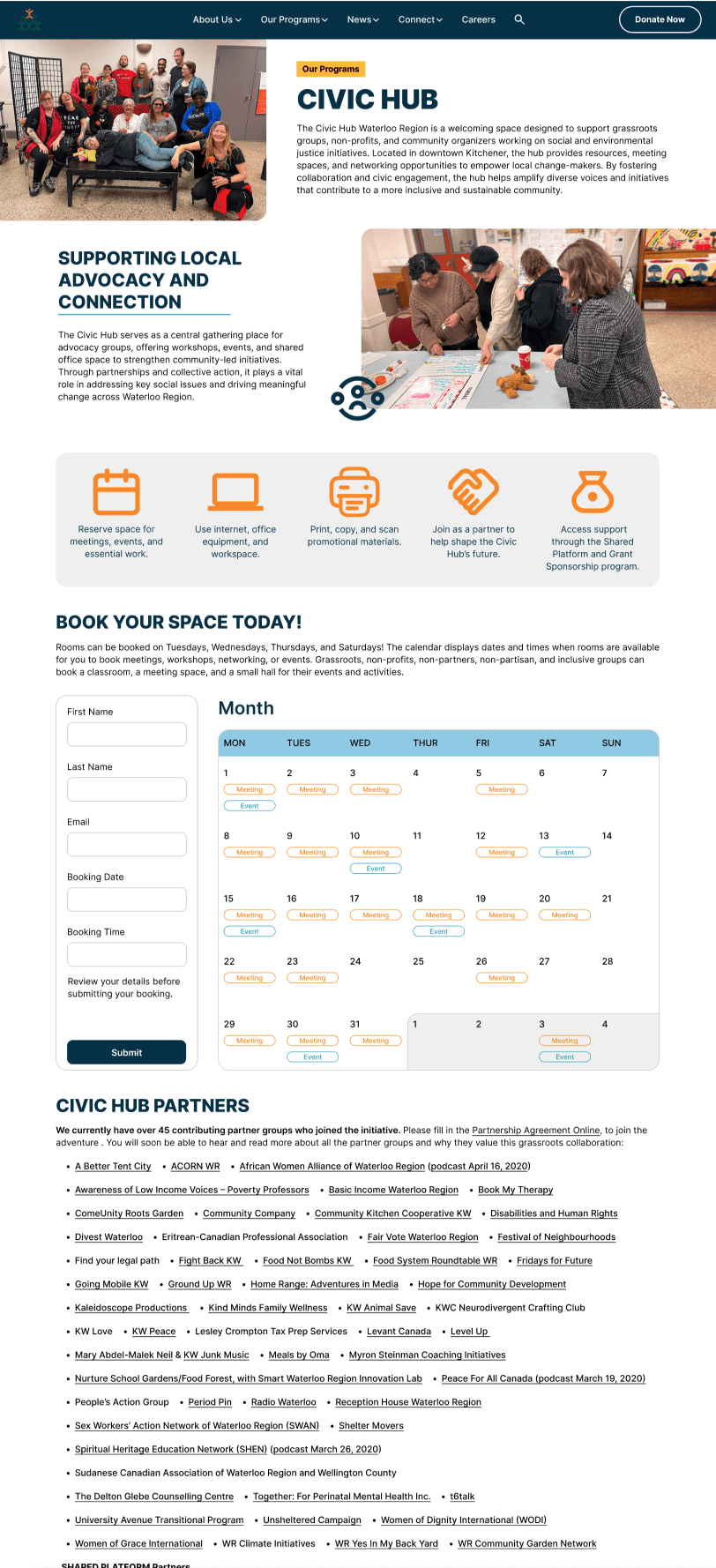
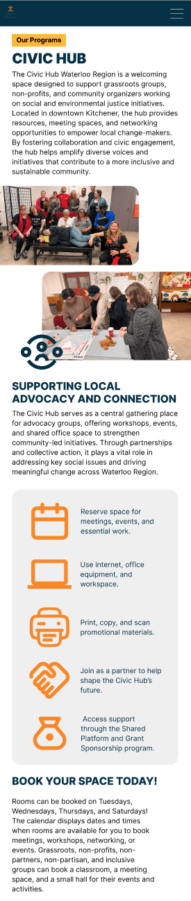
Civic Hub Program Page


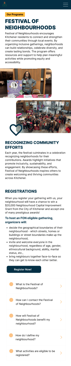
Festival of Neighborhoods Program Page


How did we address the needs of SDC?
Improved navigation clarity based on research metrics
Competitive analysis and focus group feedback showed SDC’s site scored lowest in ease of navigation. We reorganized the site structure and redesigned the navigation bar with clear categories, helping users find key information faster and reducing confusion across pages.
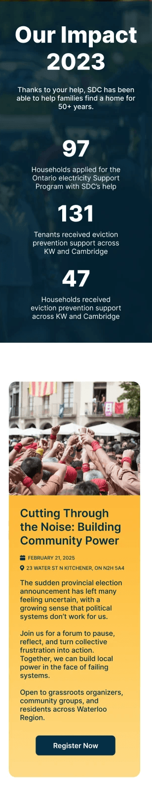
Created a stronger landing page to communicate mission and values
Research highlighted that users struggled to understand SDC’s goals and offerings. We designed a landing page that foregrounds the organization’s mission and community impact, telling their story more effectively as soon as users land on the site.
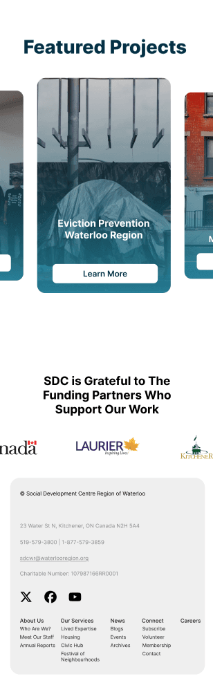
Established consistent visual language and layout across the site
SDC lacked visual coherence, which made pages feel disconnected and harder to scan. We implemented consistent spacing, typography, and visual style across all pages to build trust and support easier reading.
Created mobile breakpoints for better engagement
The research showed SDC’s site performed poorly on mobile. We designed a mobile-first layout, ensuring content was accessible and engaging for users on their phones.
Elevated content hierarchy and readability
User evaluation revealed low clarity of mission and goals. By restructuring text using clear headings and prioritizing impactful information (e.g., programs, values), we made it easier for users to engage with what matters most.
What Worked Well
Working collaboratively
Working closely with my team allowed us to divide tasks efficiently and coordinate meetings consistently throughout the project. Clear communication and shared responsibility helped us stay aligned, move quickly, and support one another across research, design, and refinement stages.
Strong early data collection
What Didn't Work
Lack of validation on final prototypes
While SDC responded positively to the final high-fidelity designs, we did not conduct formal user testing on the completed prototype. As a result, improvements were validated visually rather than through real user interaction, limiting our ability to measure usability outcomes.
Poor version control and documentation
Design iterations were continuously edited on the same Figma canvas, resulting in the loss of earlier versions.
Insufficient early page-structure planning
We could have benefited from a more detailed sitemap and clearer page-level guidelines early in the process. The lack of defined structure led to multiple revisions across pages as requirements became clearer.
Where I'll Improve
Plan more deliberately and leave time for testing
In future projects, I will focus on planning ahead by defining clearer site structures and internal milestones earlier. This includes setting aside dedicated time for user testing and validation before final delivery, ensuring design decisions are supported by real user feedback rather than assumptions.